Turning data chaos to clarity 🍀

Turning data chaos to clarity 🍀

Turning data chaos to clarity 🍀

From scattered dashboards to one source of truth — Datapulse turns data chaos into confident decisions. See insights from every tool, every team, and every moment in one clean, powerful view that just makes sense.
Daikin
Daikin
Daikin

Timeline

Timeline

Dec 2023 - Early 2024

Dec 2023 - Early 2024

INDUSTRY

INDUSTRY

B2B SAAS

B2B SAAS

MY ROLE

MY ROLE

Senior Product Designer

Senior Product Designer

Our USP 🏆

We didn’t want to make another dashboard. We wanted to build a clarity engine.

📍 Introduction

📍 Introduction

In a world drowning in dashboards, marketers, founders, and analysts juggle between Shopify, Meta Ads, HubSpot, Google Analytics, and endless spreadsheets — just to make one decision.

Meetings started not with strategy, but with arguments:

"Wait, which number are we even talking about?"


  • That’s when I realized: data wasn’t broken — alignment was.


  • So we built Datapulse, a B2B SaaS platform that unifies analytics, decodes KPIs, and helps teams make decisions fast — without drowning in dashboards.

👩🏻‍💻 My Role

👩🏻‍💻 My Role

Lead Product Designer (UI/UX)


I led the end-to-end product design process — from problem definition and user research to visual design, prototyping, and testing.

I collaborated with:


  • 1 Product Managers

  • 4 Engineers

  • 2 Data Scientists


🟢 As Lead Designer, my focus wasn’t only on pixels — it was on translating complex data flows into human joy.

🧩 Problem with Data

🧩 Problem

Defining the problem

What if we made analytics feel peaceful?

Every business team we spoke to said the same thing:

“We have data everywhere… but nowhere to actually understand it.”


They were tired of:

  • 15 different tabs open

  • CSV exports every week

  • Reports were duplicated, delayed, and disjointed.

  • Forecasts were fear-inducing, not decision-enabling.

  • Overloaded dashboards that looked like rocket control panels


    👉 The real pain? Lack of one shared source of truth.

Every business team we spoke to said the same thing:

“We have data everywhere… but nowhere to actually understand it.”


They were tired of:

  • 15 different tabs open

  • CSV exports every week

  • Reports were duplicated, delayed, and disjointed.

  • Forecasts were fear-inducing, not decision-enabling.

  • Overloaded dashboards that looked like rocket control panels


    👉 The real pain? Lack of one shared source of truth.

Defining the problem

What if we made analytics feel peaceful?

⚡ Goals

⚡ Goals

Build a platform so clear that anyone — CEO, Analyst, or Ops — could understand their business in one glance.


  • Unify data sources like Shopify, Meta Ads, HubSpot, etc.

  • Build a modular dashboard that adapts to user roles.

  • Make complex analytics feel simple, fast, and human.

  • Reduce setup time by 60% through intuitive integration flows.

  • Enhance strategies with forecasting that felt intuitive.

  • Design a delightful experience that teams actually want to use daily((because boring dashboards are a crime).


🟢 Our primary goal was to aggregate the analytics from different data sources on one platform but also make it so accessible and easy for users to understand growth metrics

Build a platform so clear that anyone — CEO, Analyst, or Ops — could understand their business in one glance.


Unify analytics → connect all data sources

  • Decode KPIs → create a shared metrics library

  • Grasp ROI → visualize impact, not just numbers

  • Enhance strategies → enable forecasting + predictions

  • Empower growth → make clarity accessible to all


🟢 Our primary goal was to aggregate the analytics from different data sources on one platform but also make it so accessible and easy for users to understand growth metrics

🙋🏻‍♀️ Our Users

🙋🏻‍♀️ Our Users

We met our heroes — real people buried under data chaos.

user archetype image

Sophia — The Strategy-Overwhelmed CMO


“I don’t need 10 dashboards. I need one answer — are we growing or not?”


Sophia is smart, busy, and allergic to clutter. She needs quick clarity, not a PhD in filters.
🟢 “Sophia doesn’t want data — she wants direction.”

Sophia — The Strategy-Overwhelmed CMO


“I don’t need 10 dashboards. I need one answer — are we growing or not?”


She needs quick clarity, not a PhD in filters.

🟢 “Sophia doesn’t want data — she wants direction.”

user archetype image
man in white crew neck shirt wearing silver necklace

Steven — The Spreadsheet Survivor


“I spend more time cleaning data than analyzing it.”


Raj is the Analyst who fights data fires daily.
He dreams of integrations that just work, and KPIs that match across teams.
🟢 “Steven smiles when dashboards clean themselves.”

woman in black tank top smiling

Lena — The Operations Hero


“I just want to know if we have enough stock for next week.”


Lena runs the ground game. She doesn’t have time to decode complex charts - she wants red = bad, green = good.
🟢 “If Lena smiles after connecting her first data source, we did it right.”

💡 Research

💡 Research

Dived into an intensive 2-week research sprint

  • 15+ user interviews across startups and mid-size teams.

  • Investigated forums and surveys

Insights

  • Data integration is a pressing concern for users, impacting their efficiency and data accuracy.

  • Real-time insights are highly desired to enable timely adjustments in marketing strategies.

  • Clarity on ROI is crucial for informed decision-making and budget allocation.

Listing out the competitors providing similar solutions

Gaps & Opportunities

  • None of the competitors offer a comprehensive solution with both real-time capabilities and seamless integration across major platforms.

  • User-friendly reporting is a common gap among competitors, providing an opportunity for our platform to excel.

  • Leveraging machine learning for personalized recommendations sets us apart, enhancing the user experience.


🔥 Design Process

🔥 Design Process

Design Sprint

Design Sprint


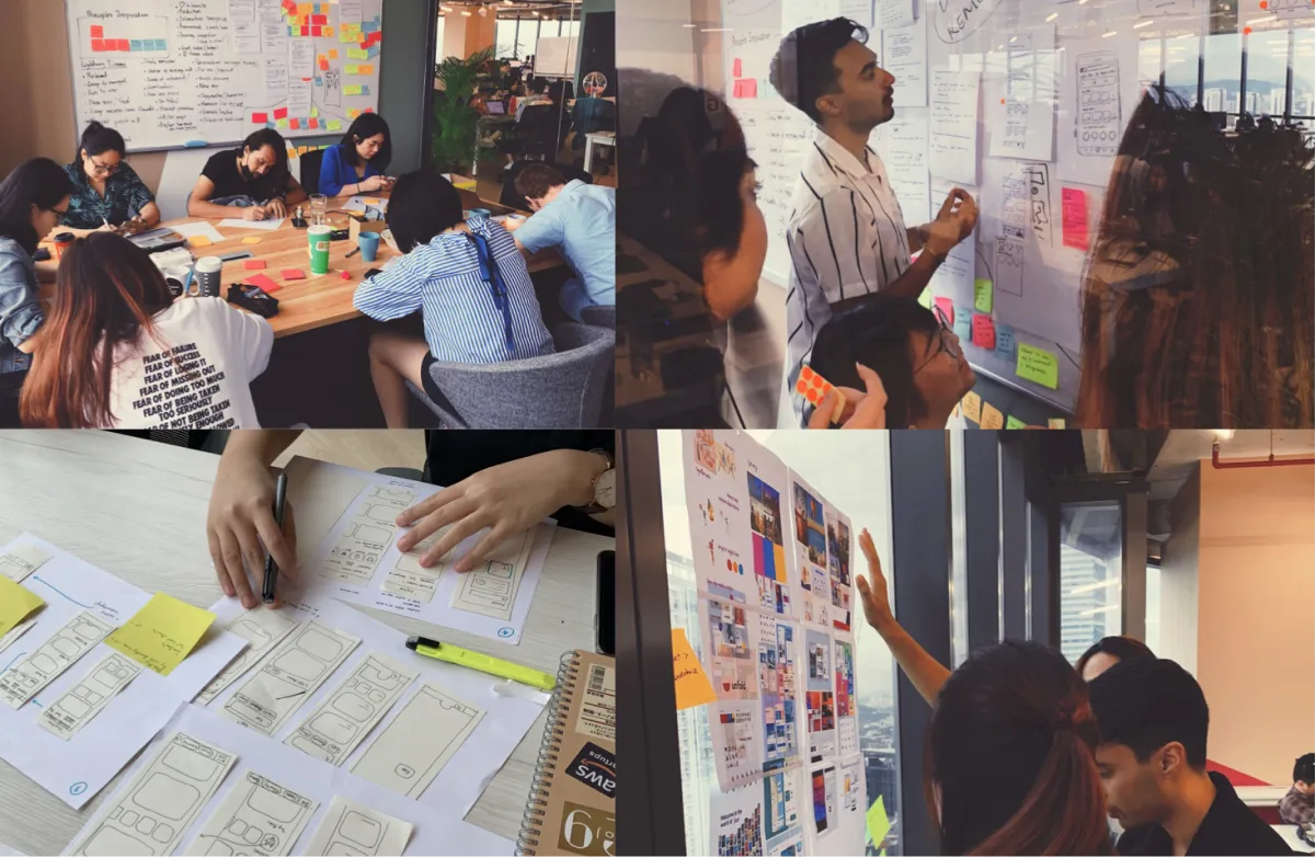
We conducted design sprints to facilitate collaboration cross-departments. Product Designers, Product Managers and Creatives contributed their fresh ideas in this sprint. The purpose of these sprints is to align everyone on the same goal—To improve our consumer experience by solving our user's problems today.

We conducted design sprints to facilitate collaboration cross-departments. Product Designers, Product Managers and Creatives contributed their fresh ideas in this sprint. The purpose of these sprints is to align everyone on the same goal—To improve our consumer experience by solving our user's problems today.

Design Sprint
Design Sprint
Design Sprint

Information Architecture Diagram

Information Architecture Diagram


We mapped the core information architecture diagram to simplify our navigation process throughout our platform across different features. Our goal: Reduce clicks, not power.


🟢 Simple navigation builds trust before delight.

We mapped the core information architecture diagram to simplify our navigation process throughout our platform across different features. Our goal: Reduce clicks, not power.


🟢 Simple navigation builds trust before delight.

📰 Wireframing

📰 Wireframing

We started lo-fi iterations, focusing on:

  • Card-based integration blocks

  • One-click connection flow

  • Visual cues for status (connected/pending)

🟢 Our product's skeleton was crafted from low-fidelity wireframes, honed through a series of continuous iterations.

MENU

MENU

dashboard

dashboard

Analytics

Analytics

Integrations

Integrations

Metrics

Metrics

Forecasts

Forecasts

Support

Support

collaborate

collaborate

FAQs

FAQs

Settings

Settings

User Guide

User Guide

Log Out

Log Out

DataPulse

DataPulse

Welcome back

Welcome back

Search

Search

dashboard

dashboard

Aug 16, 2022 - Aug 14, 2023

Aug 16, 2022 - Aug 14, 2023

Export

Export

Total Orders

Total Orders

6,520

6,520

AOV

AOV

$190.23

$190.23

Net Sales

Net Sales

$2.03M

$2.03M

Gross Profit

Gross Profit

$14.67K

$14.67K

Net Sales vs Orders

Net Sales vs Orders

Customer Count

Customer Count

Daily Tracker - Shopify

Daily Tracker - Shopify

Duration

Duration

Sales

Sales

Spend

Spend

Orders

Orders

AOV

AOV

Cost per Acquisition

Cost per Acquisition

ROAS

ROAS

MENU

dashboard

Analytics

Integrations

Metrics

Forecasts

Support

collaborate

FAQs

Settings

User Guide

Log Out

DataPulse

Welcome back

Search

dashboard

Aug 16, 2022 - Aug 14, 2023

Export

Total Orders

6,520

AOV

$190.23

Net Sales

$2.03M

Gross Profit

$14.67K

Net Sales vs Orders

Customer Count

Daily Tracker - Shopify

Duration

Sales

Spend

Orders

AOV

Cost per Acquisition

ROAS

MENU

MENU

MENU

dashboard

dashboard

dashboard

Analytics

Analytics

Analytics

Integrations

Integrations

Integrations

Metrics

Metrics

Metrics

Forecasts

Forecasts

Forecasts

Support

Support

Support

collaborate

collaborate

collaborate

FAQs

FAQs

FAQs

Settings

Settings

Settings

User Guide

User Guide

User Guide

Log Out

Log Out

Log Out

DataPulse

DataPulse

DataPulse

Welcome back

Welcome back

Welcome back

Maansi Gupta

Maansi Gupta

Maansi Gupta

Search

Search

Search

dashboard

dashboard

dashboard

Aug 16, 2022 - Aug 14, 2023

Aug 16, 2022 - Aug 14, 2023

Aug 16, 2022 - Aug 14, 2023

Export

Export

Export

Total Orders

Total Orders

Total Orders

7,743

7,743

7,743

vs last month:

vs last month:

vs last month:

6,520

6,520

6,520

AOV

AOV

AOV

$211.80

$211.80

$211.80

vs last month:

vs last month:

vs last month:

$190.23

$190.23

$190.23

Net Sales

Net Sales

Net Sales

$1.64M

$1.64M

$1.64M

vs last month:

vs last month:

vs last month:

$2.03M

$2.03M

$2.03M

Gross Profit

Gross Profit

Gross Profit

$22.81K

$22.81K

$22.81K

vs last month:

vs last month:

vs last month:

$14.67K

$14.67K

$14.67K

Net Sales vs Orders

Net Sales vs Orders

Net Sales vs Orders

This Year

This Year

This Year

Customer Count

Customer Count

Customer Count

This Year

This Year

This Year

Daily Tracker - Shopify

Daily Tracker - Shopify

Daily Tracker - Shopify

This Year

This Year

This Year

Duration

Duration

Duration

(Aug 16, 2022 - Aug 14, 2023)

(Aug 16, 2022 - Aug 14, 2023)

(Aug 16, 2022 - Aug 14, 2023)

Sales

Sales

Sales

(in Dollars)

(in Dollars)

(in Dollars)

Spend

Spend

Spend

(in Dollars)

(in Dollars)

(in Dollars)

Orders

Orders

Orders

AOV

AOV

AOV

(in Dollars)

(in Dollars)

(in Dollars)

Cost per Acquisition

Cost per Acquisition

Cost per Acquisition

(in Dollars)

(in Dollars)

(in Dollars)

ROAS

ROAS

ROAS

(Feb 16,2023 - Aug 14,2023)

(Feb 16,2023 - Aug 14,2023)

(Feb 16,2023 - Aug 14,2023)

53.1K

53.1K

53.1K

39.25K

39.25K

39.25K

8,091

8,091

8,091

4590

4590

4590

49.00

49.00

49.00

27.22

27.22

27.22

(Aug 16,2022 - Feb 16,2023)

(Aug 16,2022 - Feb 16,2023)

(Aug 16,2022 - Feb 16,2023)

50K

50K

50K

36.7K

36.7K

36.7K

7,761

7,761

7,761

4,561

4,561

4,561

48.52

48.52

48.52

25.16

25.16

25.16

Edit Key Metrics Section

Edit Key Metrics Section

Edit Key Metrics Section

Section Heading

Section Heading

Section Heading

Metric 1

Metric 1

Metric 1

Metric 2

Metric 2

Metric 2

Metric 3

Metric 3

Metric 3

Metric 4

Metric 4

Metric 4

Metric 5

Metric 5

Metric 5

Metric 6

Metric 6

Metric 6

Metric 7

Metric 7

Metric 7

Metric 8

Metric 8

Metric 8

Metric 9

Metric 9

Metric 9

Metric 10

Metric 10

Metric 10

Metric 11

Metric 11

Metric 11

Metric 12

Metric 12

Metric 12

Cancel

Cancel

Cancel

Save

Save

Save

🪄 Final Designs

🪄 Final Designs

Here’s where things got exciting.
The design had to be smart, light, and feel modern, not technical.

Unified Dashboard

Unified Dashboard


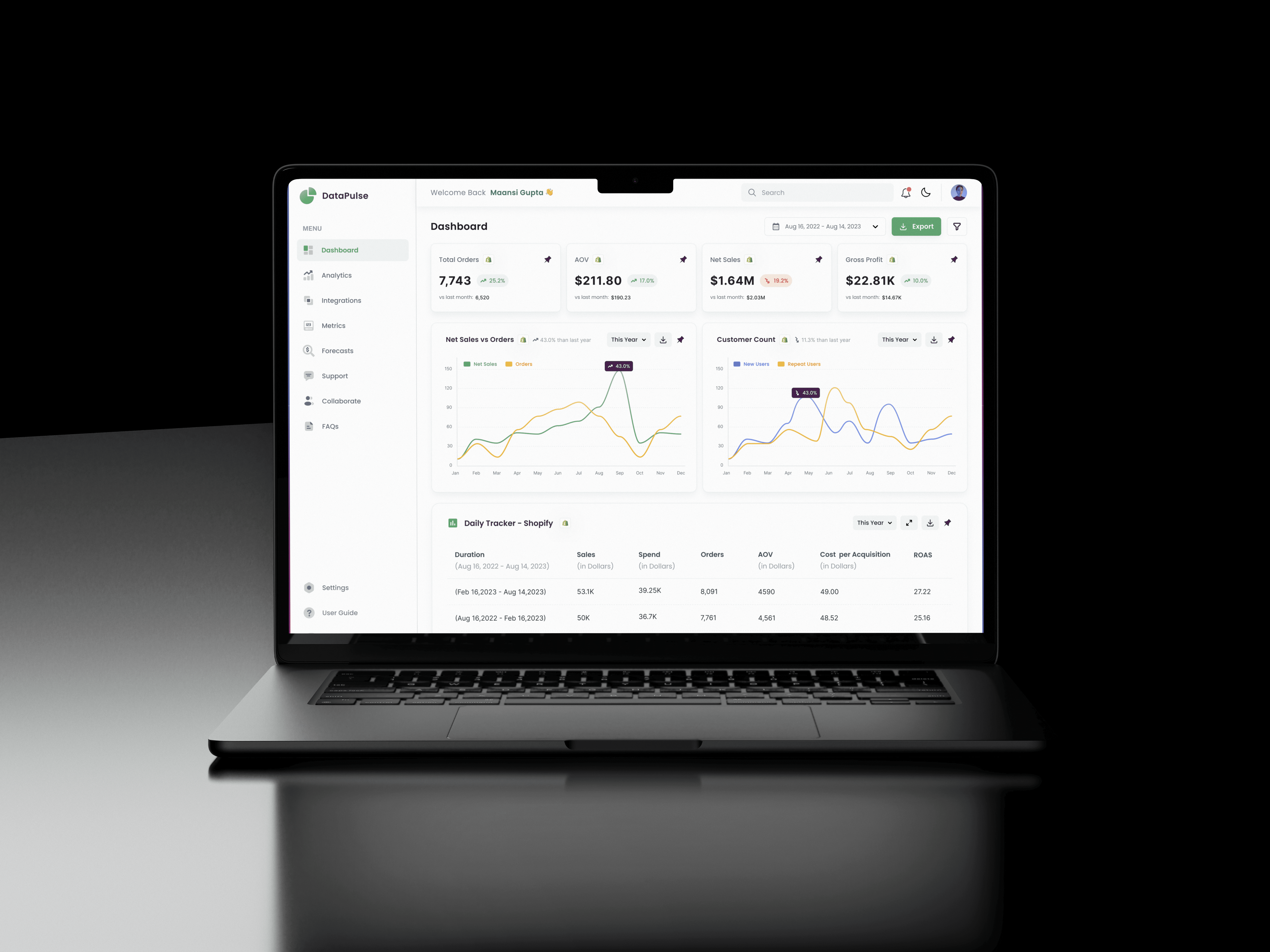
The Dashboard page brings all your connected data into one visual space.


🟢 Simple navigation builds trust before delight.


We followed a simple “glance → explore → validate” flow:
1️⃣ Summary metric cards for overall analytic insights at a top level
2️⃣ Trend charts for context
3️⃣ Drill-down tables/ reports for detailed data validation

The Dashboard page brings all your connected data into one visual space.
Instead of static graphs/charts/reports, it highlights trends, growth opportunities, anomalies, and key KPIs — so users don’t just see numbers, they understand impact. We introduced a user-friendly “pin to dashboard” feature that allows users to easily personalize their dashboard experience according to their business needs.


🟢 Simple navigation builds trust before delight.


We followed a simple “glance → explore → validate” flow:
1️⃣ Summary metric cards for overall analytic insights at a top level
2️⃣ Trend charts for context
3️⃣ Drill-down tables/ reports for detailed data validation

Workspace Management

Workspace Management


Your data, neatly sorted into Workspaces — one for each client or team (Sales, Marketing, Finance).
No clutter. No mix-ups. Just clarity.


Quick Overview of Each Workspace

Every workspace card gives a quick snapshot:

  • Data sources connected (Shopify, Meta Ads, HubSpot, etc.)

  • Update frequency (hourly or weekly)

  • Number of metrics available

  • Permission visibility (shared with all or limited)

This small, thoughtful detail saves hours of guesswork for teams handling multiple clients or data pipelines.

Your data, neatly sorted into Workspaces — one for each client or team (Sales, Marketing, Finance).
No clutter. No mix-ups. Just clarity.

🟢 Design goal: Make complex data feel effortless.


Quick Overview of Each Workspace

Every workspace card gives a quick snapshot:

  • Data sources connected (Shopify, Meta Ads, HubSpot, etc.)

  • Update frequency (hourly or weekly)

  • Number of metrics available

  • Permission visibility (shared with all or limited)

This small, thoughtful detail saves hours of guesswork for teams handling multiple clients or data pipelines.

Your data, neatly sorted into Workspaces — one for each client or team (Sales, Marketing, Finance).
No clutter. No mix-ups. Just clarity.

🟢 Design goal: Make complex data feel effortless.


Quick Overview of Each Workspace

Every workspace card gives a quick snapshot:

  • Data sources connected (Shopify, Meta Ads, HubSpot, etc.)

  • Update frequency (hourly or weekly)

  • Number of metrics available

  • Permission visibility (shared with all or limited)

This small, thoughtful detail saves hours of guesswork for teams handling multiple clients or data pipelines.

Useful Action 💎

We removed unnecessary clicks. What used to take minutes now takes seconds.

Analytic Insights in the Best Formats

Analytic Insights in the Best Formats


We stand out by offering insight flexibility: pick your preferred format - overview cards, interactive charts & trends, or detailed reports for each workspace and as per your requirements.


🟢 Design goal: Allow ease of accessibility to be able to understand analytics in any formats.

We stand out by offering insight flexibility: pick your preferred format - overview cards, interactive charts & trends, or detailed reports for each workspace and as per your requirements.

🟢 Design goal: Allow ease of accessibility to be able to understand analytics in any formats.

Edit Metrics in a Jiff ⚡

You can easily edit metrics/KPIs based on your requirements for your personalized workspace.

Edit Metrics in a Jiff ⚡

You can easily edit metrics/KPIs based on your requirements for your personalized workspace.

Edit Metrics in a Jiff ⚡

You can easily edit metrics/KPIs based on your requirements for your personalized workspace.

Data Source Integrations

Data Source Integrations


Easily connect data from Shopify, Meta Ads, Google Analytics, HubSpot, and more — all in one place.
Each integration shows connection status and quick options like “Details” or “Configure.”
Simple layout and clear CTAs make setup fast and easy for everyone.


🟢 Goal: Make connecting data feel effortless.

Easily connect data from Shopify, Meta Ads, Google Analytics, HubSpot, and more — all in one place.
Each integration shows connection status and quick options like “Details” or “Configure.”
Simple layout and clear CTAs make setup fast and easy for everyone.


🟢 Goal: Make connecting data feel effortless.

Metrics that Boost Performance

Metrics that Boost Performance


No two analysts think alike — so why should their dashboards look the same?


Now monitor the metrics for each workspace in a well consolidated manner and maximize your performance targets.

No two analysts think alike — so why should their dashboards look the same?


Now monitor the metrics for each workspace in a well consolidated manner and maximize your performance targets. “My Metrics” lets users build their own performance view — pin favorite KPIs, know exact valuation numbers, percentage increase/decrease in valuation and the data sources connected to calculate that metric performance.

Rich Metric Library

Rich Metric Library


Say goodbye to crafting custom metrics – our extensive curated metric library has you covered. Users can browse, search, or favorite metrics — and even see the formula behind each.
No more second-guessing what each number means.

Say goodbye to crafting custom metrics – our extensive curated metric library has you covered. Users can browse, search, or favorite metrics — and even see the formula behind each.
No more second-guessing what each number means.

Our Pro Features : Advanced Forecasts

Our Pro Features : Advanced Forecasts


AI quietly does the heavy lifting behind clean, friendly visuals.

💸 Sales Prediction

Predict future revenue based on your past sales.
The system visualizes seasonality, trends, and anomalies — so teams can act early, not react late.


📦 Inventory Prediction

Plan stock smartly.
Datapulse predicts which products may go out of stock soon and when to reorder — right from your dashboard.


🔗 Product Binding

Find unexpected pairings — which products often sell together.
Helps in smarter cross-selling and bundle strategies.

AI quietly does the heavy lifting behind clean, friendly visuals.

💸 Sales Prediction

Predict future revenue based on your past sales.
The system visualizes seasonality, trends, and anomalies — so teams can act early, not react late.


📦 Inventory Prediction

Plan stock smartly.
Datapulse predicts which products may go out of stock soon and when to reorder — right from your dashboard.


🔗 Product Binding

Find unexpected pairings — which products often sell together.
Helps in smarter cross-selling and bundle strategies.

Quick Support & FAQs

Quick Support & FAQs


Feeling stuck? Don't worry—we're here to help. Chat with us or reach out directly, and let us know your concern.


Dedicated FAQ section for commonly asked questions.

Feeling stuck? Don't worry—we're here to help. Chat with us or reach out directly, and let us know your concern.


Dedicated FAQ section for commonly asked questions.

Manage Collaborators

Manage Collaborators


Feeling stuck? Don't worry—we're here to help. Chat with us or reach out directly, and let us know your concern.


Dedicated FAQ section for commonly asked questions.

Teams collaborate better when roles are clear.
This section lets Admins invite teammates, assign access levels, and share workspaces instantly.

Real-time permission previews show exactly who can view, edit, or comment — no surprises.

🔍 Usability Testing

🔍 Usability Testing

We ran guerrilla tests with real users:

  • 5-minute “first-use” test: Can you find your top KPI?

  • A/B tested dashboard layout density

  • Conducted internal feedback loops with data analysts


🧠 Result: 90% users found their main insights in under 5 seconds.

Small Fixes That Made Big Difference

  • Button text tweak: “Add” → “Connect Account”

  • Added tiny info icons for clarity

  • Redesigned empty states with motivation (“Let’s get your first data in!”)

💫 Impact

💫 Impact

After the first pilot launch:

  • 30% faster KPI discovery

  • 📈 42% more users used forecasting

  • 🕒 Report prep time dropped by 50%

  • 🤝 Teams aligned faster on shared numbers

📗Learnings

📗Learnings

  • Less is more: Simpler views boosted user confidence.

  • Data-Informed Design: Iteration is the key to progress, so keep refining the product.

  • Speak human: Replacing jargon with plain language improved comprehension.

  • Process > perfection: Iteration with real feedback trumped pixel polish.

  • Design leadership = orchestration: My biggest success was aligning everyone around clarity.

👋 Future

👋 Future

Datapulse is just getting started. Coming next:

  • 🤖 AI Recommendations: From “what happened” → “what to do next.”

  • 💬 Natural Language Queries: Ask data questions in plain English also supporting voice commands in future.

  • 🔗 Workflow Integrations: Slack, Notion, Teams.


🟢 Goal: Our clarity engine is about to get smarter.

Bug fixes

For a project of this scale, even though we have already fixed plenty of bugs before public release, there are bound to be minor bugs.

Post-launch optimization

This is a crucial next step for every UX improvement or product launch. With informed, actionable insights, we are able to design a better experience for our consumers.

Continue to design better experiences

To follow through our product roadmap and continue to stick to our design principles.

This has been one of my coolest contributions at DataPulse. Couldn't have done so without the amazing team at DataPulse! Huge kudos to our heroes in the product engineering team, our QA team, and the data science team.

Thank you for reading through! Hope you enjoyed learning about my design and thought process. :)

Our Observation 🧐

It wasn’t a data problem. It was a clarity problem disguised as data.

Have an idea?

Let’s talk about it

Let’s talk about it

Let’s talk about it

Got an opportunity, want to team up on something interesting, or just want to say hi !

guptamaansi3@gmail.com

Copyright ©2026 - Maansi Gupta .

Copyright ©2026 - Maansi Gupta .

All Rights Reserved

All Rights Reserved

Create a free website with Framer, the website builder loved by startups, designers and agencies.